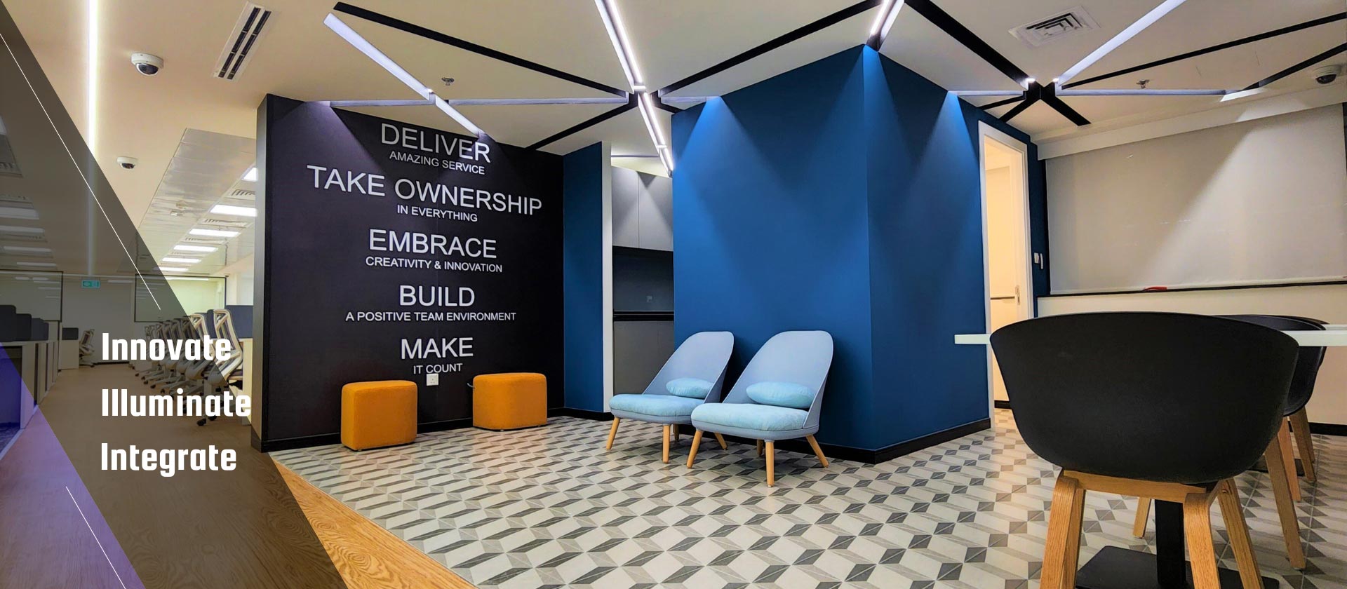
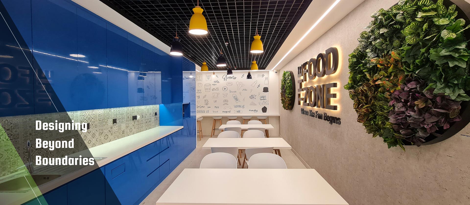
Send us an Enquiry

The Ultimate Guide to Creating a Stunning Colour Scheme for Your Interior

The Ultimate Guide to Creating a Stunning Colour Scheme for Your Interior

The Ultimate Guide to Creating a Stunning Colour Scheme for Your Interior

Colour is more than just a decorative element; it is the emotional language of design. It speaks to us in tones of tranquility, vibrancy, elegance, and energy. In the ever-evolving world of interior design, especially here in the heart of Dubai where aesthetics meet innovation, crafting the perfect colour scheme isn’t just an artistic decision—it’s a strategic one. Whether you are designing a luxury villa in Palm Jumeirah or revamping a modern office in DIFC, your colour palette will be the heartbeat of the space.

But how do you create a colour scheme that stuns, inspires, and stands the test of time? Welcome to your ultimate guide.


1. Understand the Psychology of Colour

Every colour has a story. Before selecting shades, understand what they convey:

  • Blue = Calmness, trust, professionalism

  • Green = Nature, harmony, rejuvenation

  • Yellow = Optimism, creativity, warmth

  • Red = Passion, energy, urgency

  • Neutral tones = Sophistication, timelessness, versatility

By aligning colours with the purpose of the space, you can influence mood, behavior, and even productivity.


2. Choose a Dominant Hue

The dominant colour sets the tone. This should align with the function and identity of the space. For example, a soft taupe or creamy white can serve as a serene base in residential interiors, while a bold navy or charcoal might anchor a high-end corporate setting.


3. Build Around the 60-30-10 Rule

This classic rule helps balance your palette:

  • 60%: Dominant colour (walls, large furniture)

  • 30%: Secondary colour (textiles, furniture accents)

  • 10%: Accent colour (artwork, accessories, trims)

This structure creates cohesion and ensures your scheme feels intentional.


4. Embrace Contrast, But Harmoniously

A great colour scheme has rhythm. Mix light and dark tones to add dimension. Don’t shy away from unexpected combinations—a pop of emerald in a room of neutrals, or a pastel pink paired with matte black—but always ensure there’s a visual connection between elements.


5. Consider Natural & Artificial Lighting

Lighting alters perception. Colours appear different in natural daylight, warm incandescent light, or cool LED. Always test paint swatches in varying lighting conditions before making final decisions. In Dubai’s sun-drenched spaces, cooler tones might feel refreshing, while in shaded areas, warmer hues bring coziness.


6. Integrate Texture and Material Finish

Colour isn’t just about paint. The same shade can feel completely different depending on whether it’s matte, glossy, velvet, or metallic. For instance, a matte olive green wall feels earthy and grounded, while the same colour in a silk drapery feels luxurious and modern.


7. Reflect Your Personality or Brand

Whether you’re designing for a home or a business, the colour scheme should echo your identity. For a vibrant cafe, energetic yellows and coral tones invite conversation and cheer. For a minimalist wellness spa, soft beiges and sage greens promote calm and serenity.


8. Use Colour to Define Zones

In open-plan spaces, colours can be used strategically to distinguish areas. For instance, a darker hue in the lounge zone and a lighter tone in the dining space helps create visual boundaries without physical partitions.


9. Don’t Forget About the Fifth Wall

The ceiling is often overlooked but can dramatically elevate a room. Consider soft tones to open up a space, or go bold for a dramatic, contemporary twist. In luxury interiors, a touch of gold or a soft metallic sheen can add depth and elegance.


10. Be Timeless, Not Trendy

Dubai is a hub of evolving trends, but not all of them stand the test of time. Choose classic foundations and layer trends through accessories, textiles, and art. This way, your base remains timeless, while the overall aesthetic stays fresh and adaptable.


Final Thoughts: The Art of Balance

Creating a stunning colour scheme is not about choosing the most vibrant or expensive palette. It’s about finding the harmony between style, function, emotion, and story. Colour should serve your lifestyle or brand vision, elevate the space’s purpose, and above all, make you feel something profound every time you walk in.

So whether you’re beginning your dream project or refreshing your brand space, use colour not just as a tool—but as a narrative. With Winteriors Decor, Let every shade tell a story. And remember: in interior design, colour isn’t just seen. It’s felt.


Share :

Add New Comment

 Your Comment has been sent successfully. Thank you!   Refresh
Error: Please try again

Dubai

Abu Dhabi